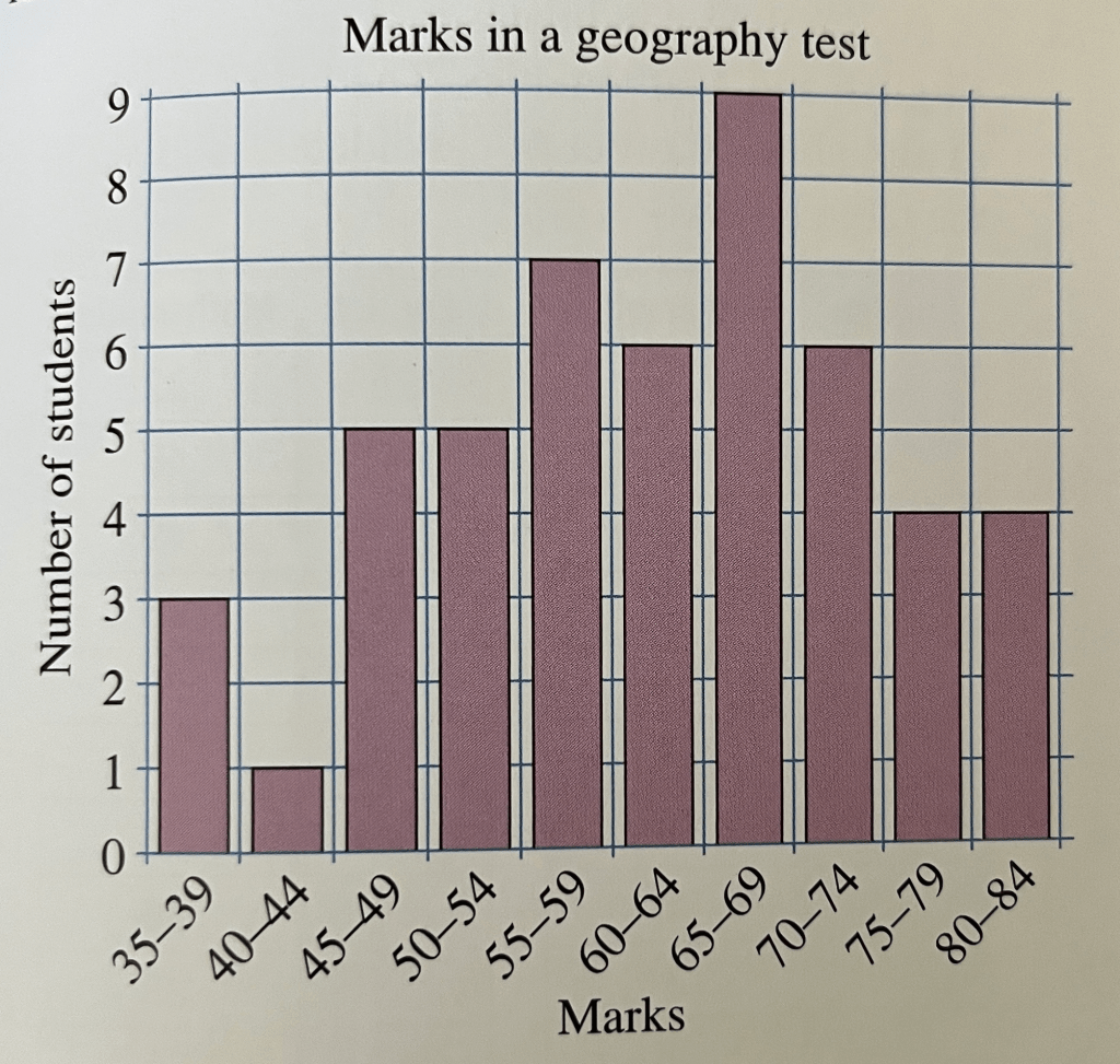
If we have lots of data we can often group it to make a bar chart that is more useful – also called a frequency diagram. Suppose 50 students took a test and got the following marks:
35. 37. 38. 43. 45. 47. 47. 48. 49. 51. 53. 54. 54. 54. 55
56. 57. 57. 57. 59. 59. 60. 60. 62. 63. 64. 64. 65. 66. 66
67. 68. 68. 69. 69. 69. 70. 71. 72. 72. 72. 74. 76. 77. 78
78. 81. 81. 84. 84
If we made a separate bar for each datapoint, our bar chart would be really large and wouldn’t really demonstrate the patterns in the data. Instead we could group the data together as shown below:
Exercise
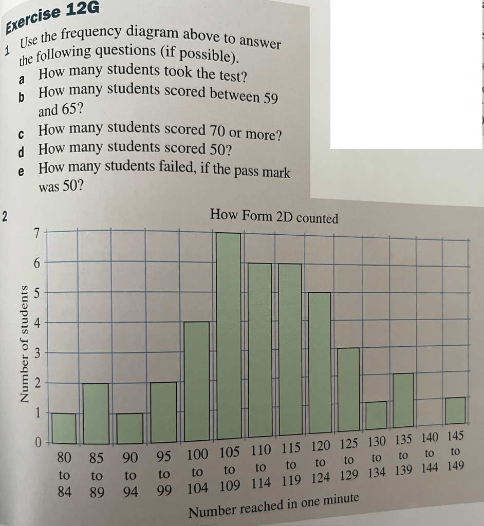
Answers
1.) (a.) 50, (b.) 6, (c.) 14, (d.) You can’t tell, (e.) 9
2. (a.) 41, (b.) No one counted less than 80, (c.) 7, (d.) 3, (e.) 2, (f.) no, (g.) no, (h.) none
