A slightly more sophisticated version of a pictogram is called a bar chart. It is quicker and easier to draw as you don’t have to draw lots of pictures.
Let’s try drawing one for the same data about student absences:
| Day | Monday | Tuesday | Wednesday | Thursday | Friday |
| Number Absent | 2 | 3 | 5 | 1 | 7 |
The bars can go horizontally or vertically – vertical bars are the most common. Instead of a key we normally use an axis, with categories or a scale. There should be a gap between each two bars.
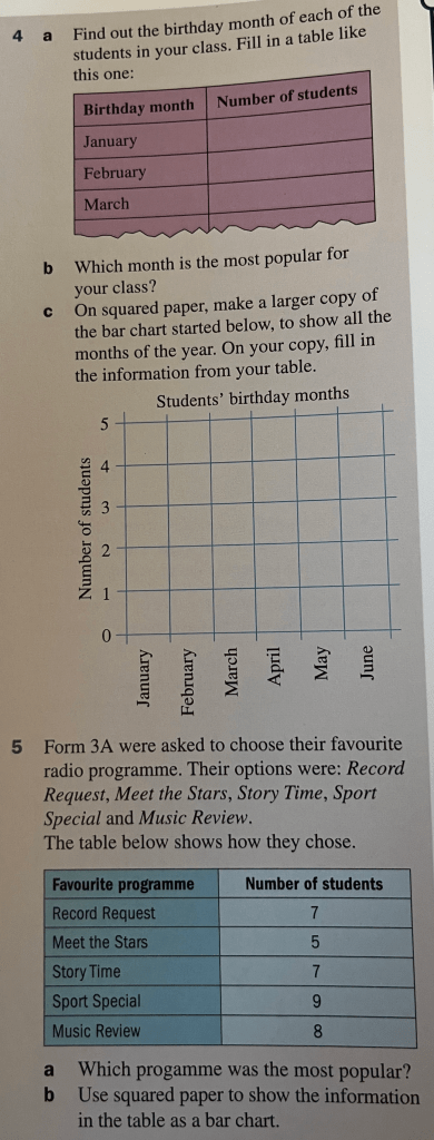
Exercise


Answers
1.) (a) Green – tallest bar (b) Purple – shortest bar (c) Blue & red (d) 33 (e) Green, Blue, Red, Yellow, Pink, Orange, Purple (f) Blue: 6, Pink: 4, Green: 7, Orange: 3, Red: 6, Purle: 2, Yellow: 5.
(2.) Science
(3.) (a) 3, (b) 3, (c) Wednesday
(5.) Sports Special
Large numbers of data
Bar charts make it easy to represent large numbers of data. We just use a suitable scale.
Worked Example
The below table shows how a selection of students come to school each day. Draw a bar chart to represent this information:
| Means of transport | No. of students |
| Bus | 70 |
| Car | 40 |
| Bicycle | 20 |
| Walk | 80 |
Exercise
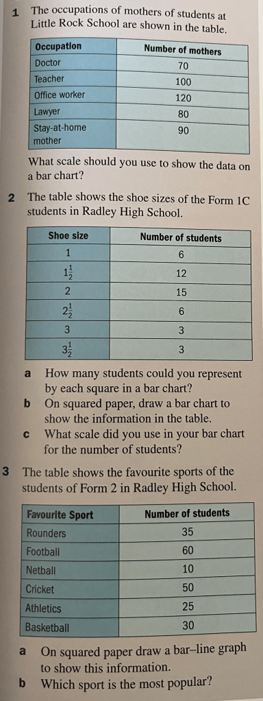
N.B. In question 3, where it asks for a a “bar-line graph”, we will just draw a normal bar chart (so our answer may look a little different to the answer given below and that’s ok).

Answers
1.) One step represents 20 mothers
2.) (a) 2 students
3.) (b) Football
4.) (a) 10 (b) 15, (c) 95, (d) $9.50
