Unlike all of the other graphs that we have looked at so far, scatter graphs are not frequency diagrams.
We use a scatter graph to look for a correlation between two variables. For instance we might use it to look for a correlation between a person’s income and their body weight. We do it by labelling one variable on the x-axis and the other variable on the y-axis and then putting points on our graph for each member of our dataset based on their income and weight.
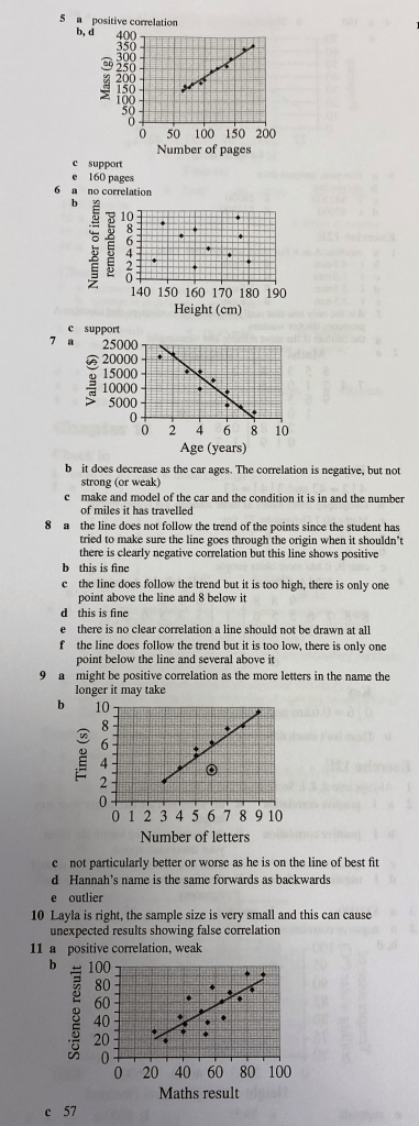
We can identify the following types of correlation: Strong positive, weak positive, weak negative and strong negative. We may also identify that there is no correlation. Let’s look at what the graphs would look like for each of these.
If just one or two items in the dataset are very far from the pattern of the other points, we call these outliers. They could be due to a mistake, or some other reason.
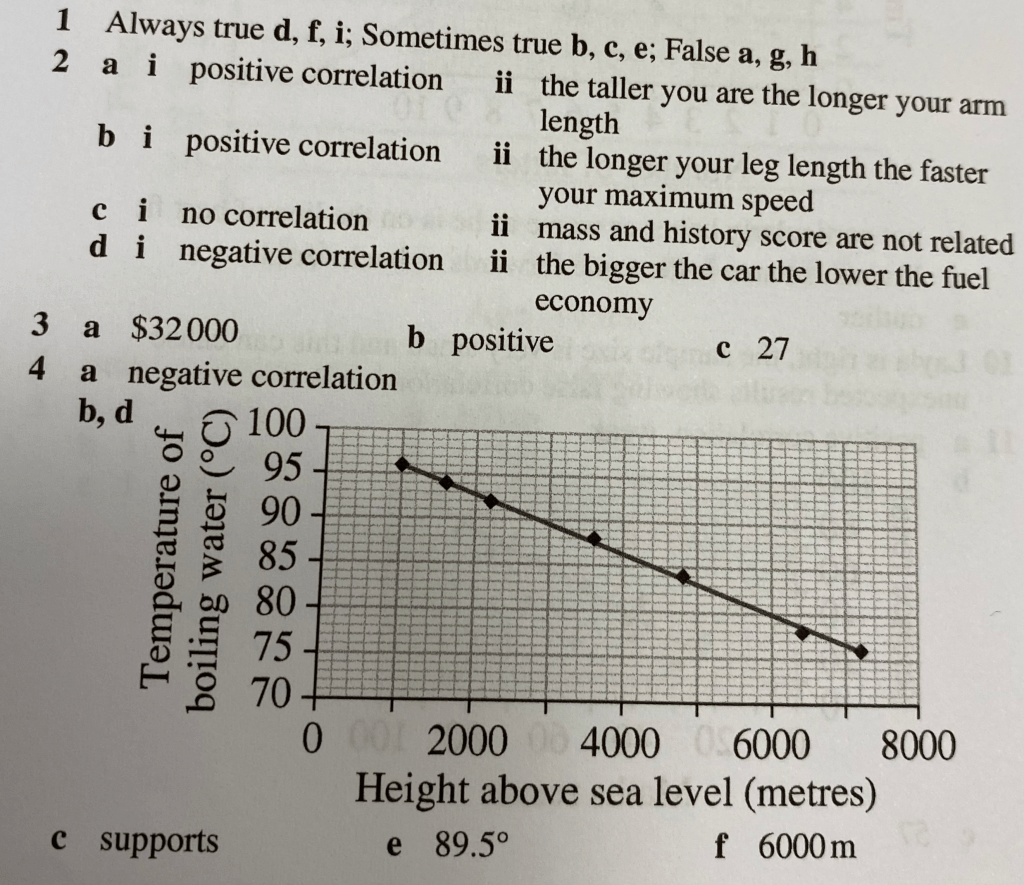
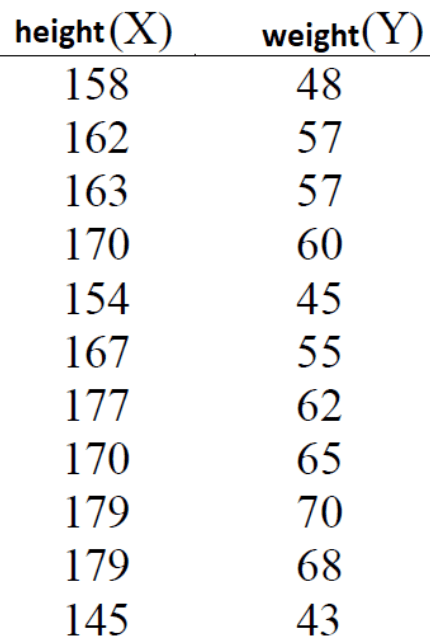
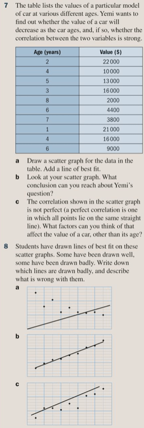
Let’s draw a scattergraph for the data below:
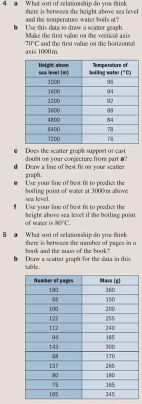
Line of best fit
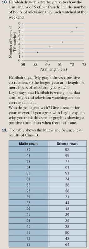
Where a pattern is clear in a scatter graph we can draw a line of best fit to more clearly show the relationship. This should be a straight line, it does not have to pass through the origin (although it might), and should have about half of the points on either side of it.
Exercise
Let’s complete exercise 12F on pages 188 to 192 of the textbook:

The answers are below: