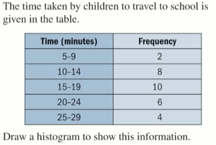
Now we are going to look at a slightly more sophisticated type of frequency diagram.
It is more sophisticated so instead of just dealing with categories of data (blue eyes, brown eyes, etc.), it can deal with height.
Unlike on the bar chart the scale on the x-axis will be a continuous scale (going up in equal steps)
We also won’t have any gaps between the bars.
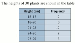
Note that the data in the table above is grouped continuous data. Each of the groups of data above (e.g. 15-17cm is high) is called a class, and the class width is 2cm (can you see why?). The class boundaries of the 18-20 class are 17.5cm and 20.5 cm. Can you see why?
Example
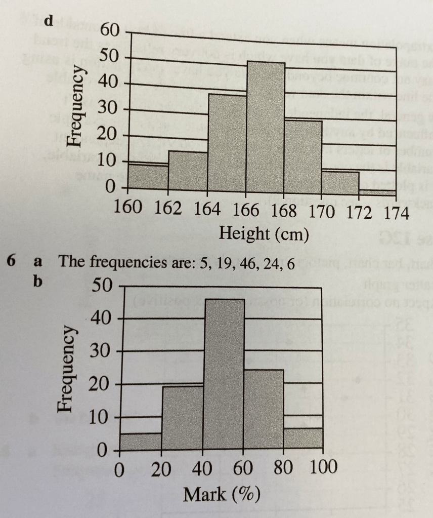
Exercise
This is exercise 12C from pages 181 to 183 of the textbook:


The answers are below: