First let’s remind ourselves of some of the popular graphs used to display data.
The first selection of graphs we are looking at are all types of frequency graph, that is, they all tell us how much of different categories exist
Bar Chart
In a bar chart we label our categories along an x-axis and label our frequency on an x-axis. A pictogram is an alternative sometimes used, where we choose a picture as a key to represent a certain frequency
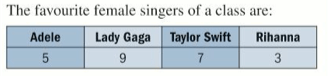
Example
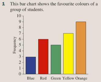
Exercise
This is exercise 12A from page 178 of the textbook:
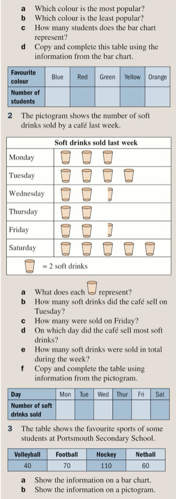
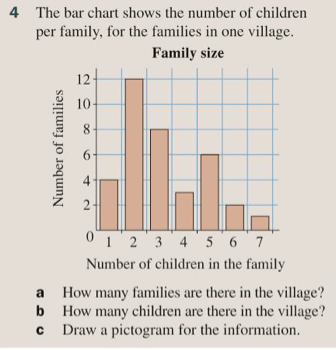
The answers are below:

