Topic Overview
STATISTICS: The technology of extracting meaning from data (in order to make inferences)
- Data Cycle:
- Collecting Data (sampling, tally charts);
- Representing Data (numbers, graphs);
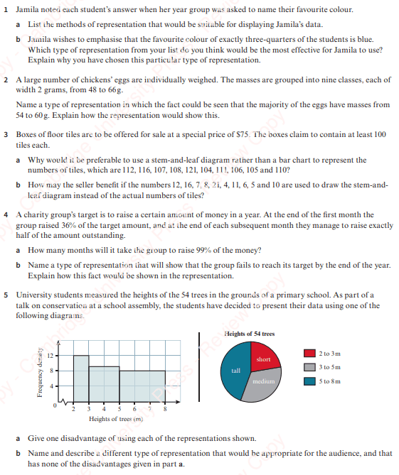
- Analysing Data (comparisons, conclusions).
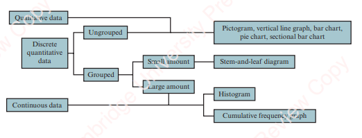
- Types of Data
- Qualitative;
- Quantitative
- Discrete;
- Continuous.
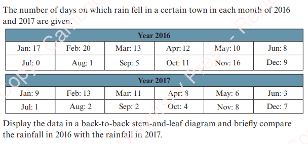
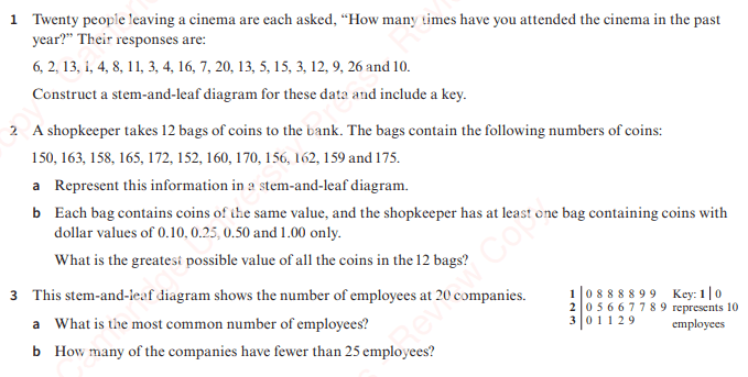
Stem and Leaf Diagrams
Worked Example 1
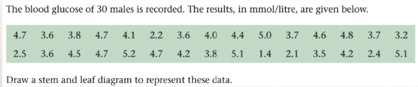
- Notes:
- Easiest to put in unordered first and then do again ordered;
- Mark values when used to help avoid double counting;
- Do “hash-check” after completing to ensure all values collected;
- Can use back-to-back stem-and-leaf diagrams for comparisons;
- Must have a key.
Worked Example 2
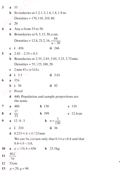
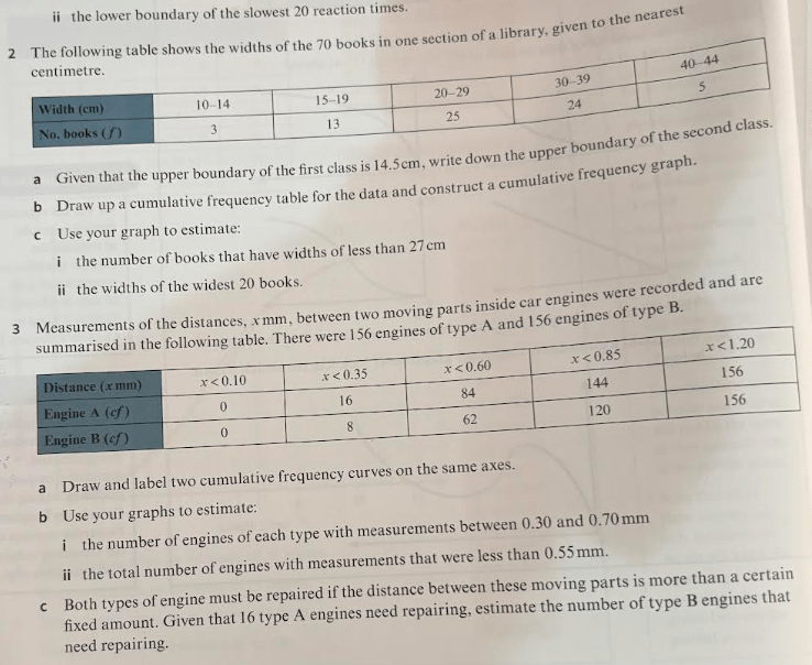
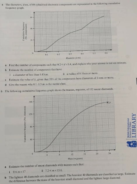
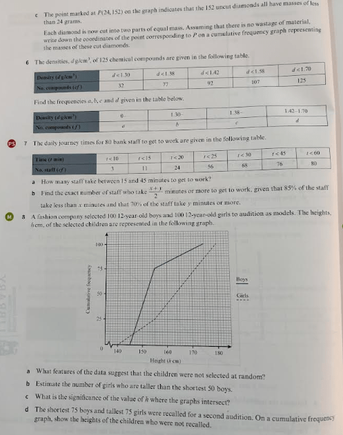
Exercise 1

Answers

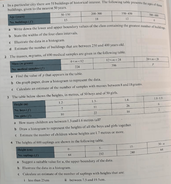
Large Sets of Data
Large sets of data are generally presented in classes. This involves some loss of data. Typically 5-10 is a “good” number of classes.
Labelling of tables for such data must be unambiguous.
What do you think about this? What kind of data is it? Is there an issue? Is there a better way to write it?
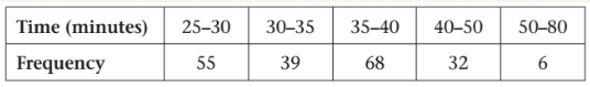
Histograms
- Used to represent continuous data
- y-axis shows frequency density = frequency / class width
- Why do we need to do this and not just put frequency on the y-axis?
- No spaces between bars
- Area of bar is proportional to frequency.
Worked Example
The masses, m kg, of 100 children are grouped into two classes, as shown in the following table:
| Mass (m kg) | 40 – 50 | 50 – 70 |
| No of children (f) | 40 | 60 |
a. Illustrate the data in a histogram;
b. Estimate the number of children with masses between 45 and 63kg.
Exercise 2
Answers
Cumulative Frequency Graphs
Each point on the y-axis denotes a running total
Can be connected to zero
Points may be joined with straight lines (frequency polygon) or with curves (frequency curve)
Can read off from graph, e.g. number of values in top 20%
Worked Example
The reaction time, t seconds, of 66 participants was measured in an experiment and presented below:
| Time (t seconds) | No of participants (f) |
| 0 – 1.5 | 0 |
| 1.5 – 3 | 3 |
| 3 – 4.5 | 5 |
| 4.5 – 6.5 | 24 |
| 6.5 – 8.5 | 22 |
| 8.5 – 11 | 8 |
| 11 – 13 | 4 |
1.) Draw a cumulative frequency polygon to represent the data;
2.) Use your graph to estimate:
(a) The number of participants with reaction times between 5.5 and 7.5 seconds; and
(b) The lower boundary of the slowest 20 reaction times.
Exercise 3
Answers

Summary of Data Representation
Each of the methods of representing data that we learn have different pro’s and con’s. For instance, grouping data in a frequency table makes it more concise and easier to read, but loses some of the detail of the raw data.
Our last exercise lets us contrast the different types of data representation and as normal is followed by mixed exercises on this topic.
Exercise 4

Mixed Exercises

Answers