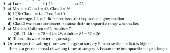
A frequency polygon is an alternative to a bar chart, where instead of drawing bars, we simply mark a point at the midpoint of the top of the bar and join these points, as illustrated below:
We should remind ourselves at this point that data can be either discrete or continuous.
Example
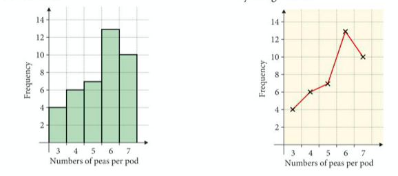
Below we have the length of 36 pea pods in mm. This is continuous data, so a length of 87.8mm for instance would be written down as 88mm.
Let’s put the data into a grouped frequency table and then use that frequency to draw a frequency polygon.
Exercise
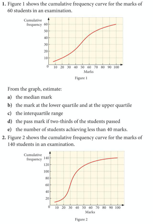
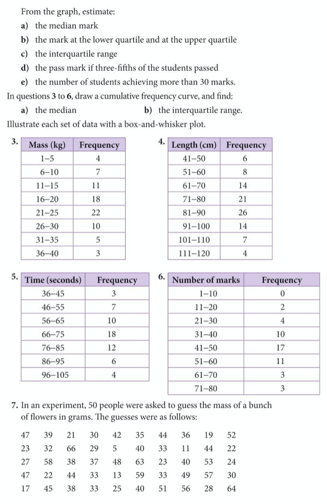
Now let’s complete exercise 12 on pages 171 to 173 of the core textbook, detailed below:
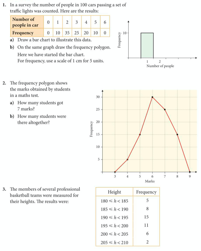
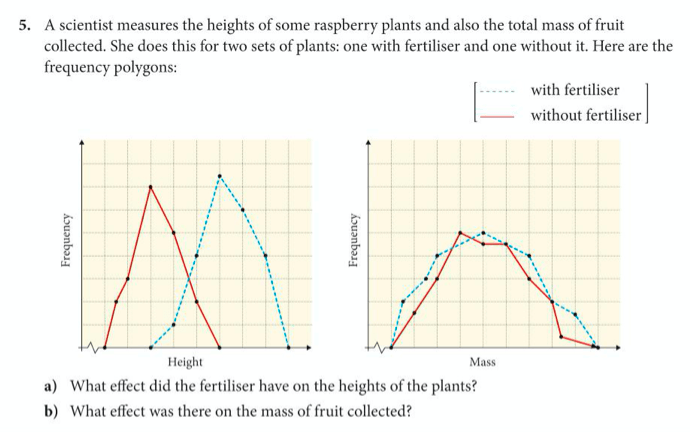
Below are the answers:

Extension work: Box and Whisker Plots
The 5 most important numbers to represent a dataset are the smallest number, the largest number, the median, and two numbers called the upper quartile and the lower quartile.
After finding the median, we find the two quartiles by finding the median of the bottom half of the data (the lower quartile) and the median of the upper half of the data (the upper quartile). We can also calculate another useful measure of spread, which is called the interquartile range by taking the difference of these two numbers.
A box and whisker plot is a simple diagram where we draw an x-axis with a scale and then mark 5 vertical lines, one for each of the key statistics: minimum, lower quartile, median, upper quartile and maximum. We then join these lines to look like a cats whiskers, as shown in the example below.
Example
Below are examples showing how to calculate the interquartile range of a dataset and how to draw a box-and-whisker plot.
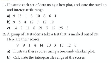
Find the quartiles and interquartile range for the following numbers: 8 9 5 11 5 20 8 7 8 6 3 14. Draw a box and whisker diagram to represent them.
Do the same with the following numbers: 12 21 8 20 12 20 9 22 17 5 19
Exercise
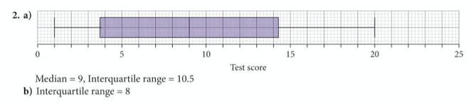
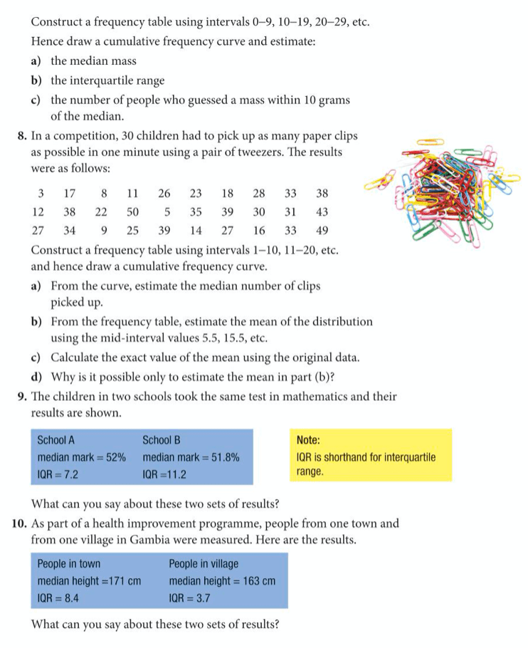
Now complete exercise 8 on pages 355 to 356 of the extended textbook:
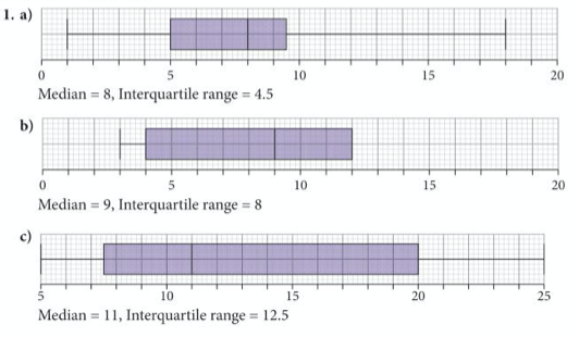
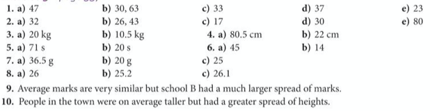
The answers are below:
Extension work: Cumulative Frequency
Cumulative Frequency is like a running total, so we associate each data point with the total frequency of itself and all the data points before it.
A cumulative frequency polygon is similar to a frequency polygon, but the y-axis shows us the cumulative frequency, which is marked not at the midpoint of the class, but at the upper boundary of the class. It is especially useful for finding the median and quartiles.
Read through the following example to see how to construct a cumulative frequency diagram and a corresponding box-and-whisker plot.
Example
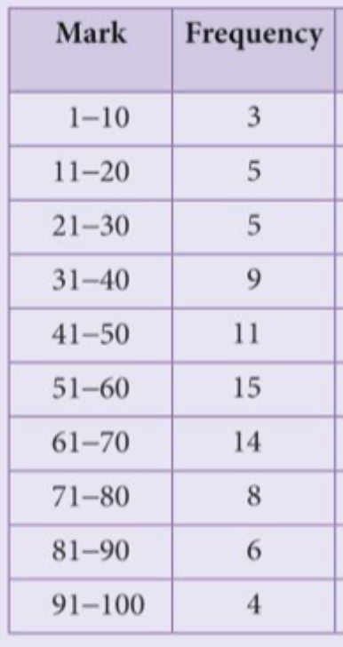
The following table shows the marks scored by 80 students in an examination.
- Plot a frequency polygon
- Plot a cumulative frequency curve and use it to estimate the median and the interquartile range.
- Illustrate the data on a box and whisker plot.
Exercise
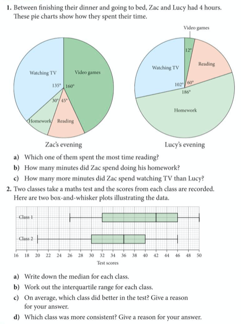
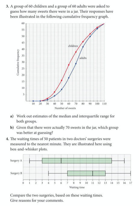
Now try yourself, by completing exercise 9 on pages 357 to 359 of the extended textbook:
The answers are below:
Further Extension Work: Comparing Datasets
We can use measures of location, measures of spread and the various graphs which we have seen to compare different datasets and make sensible comments about their differences. Let’s try this below:
Exercise: Complete exercise 10 on pages 360 and 361 of the extended textbook:
The answers are below: