A bar chart is probably the most popular way of presenting data. Later we will also look at a histogram, which is more complicated form of bar chart for continuous data.
The basic principle of a bar chart is that:
- one axis contains categories, e.g. eye colour: brown, blue, green, grey;
- the other axis displays frequency, e.g. how many people have that colour eyes.
Normally the frequency axis is the y-axis, but not always.
As usual, the axis must go up in equal steps, preferably with 5-10 steps marked on its scale.
Example with Teacher:
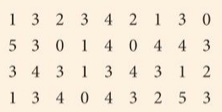
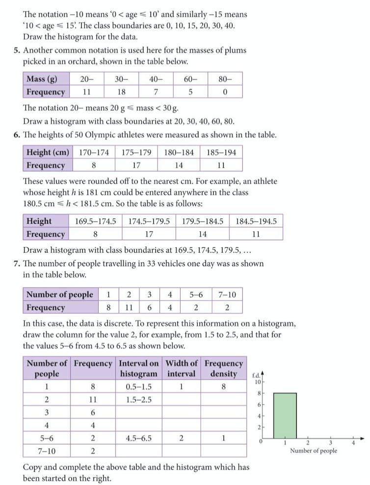
The following shows the scores of 36 students in a spelling test. Put the information first into a tally chart and then into a bar chart:
Exercise for Students:
Two dice were thrown sixty times, and the below table shows the score recorded each time:
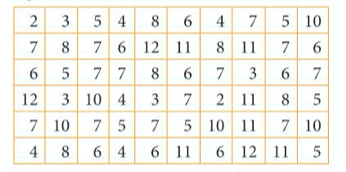
Put this information into a tally chart and then present the data on a bar chart.
Grouping Data
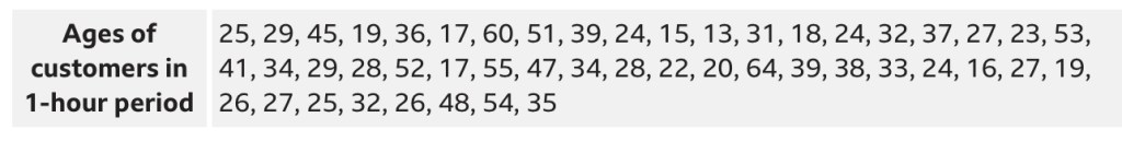
Often it is not practical to show a different bar for every value, and so we group the data. For instance, if wanted to compare how many people of each age were in a rock concert, instead of having 60 different bars, it would be more useful to group the people into age groups, e.g. 1-10, 11-20, 21-30, etc.
A sensible number of groups is typically 5-10 groups.
Example with Teacher:
Let’s decide on sensible groups for the below data, and put it into a tally chart and then draw the corresponding bar chart:
Second worked example:
Below are the answers:
Histograms – Extension Work
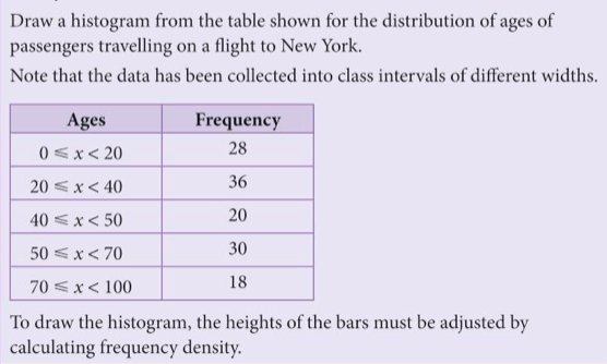
A histogram is similar to a bar chart, but is primarily for continuous data (e.g. weight, height). It is especially effective where we have grouped data where the groups have different sizes.
With a histogram, instead of the height of the bar representing frequency, it is the area of the bar that represents frequency.
In order to make this happen, the y-axis should show not frequency, but instead frequency density. We calculate frequency density as frequency ÷ class width.
Read through the below example on drawing a histogram, then complete exercise 4 on page 341 of the extended text book. The questions from this book are detailed below.
Example
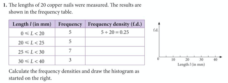
Question Set:
Answers

