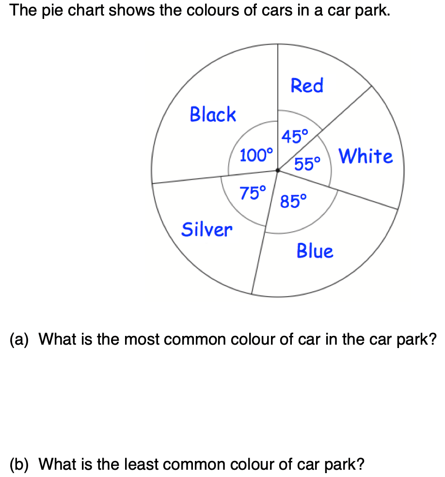
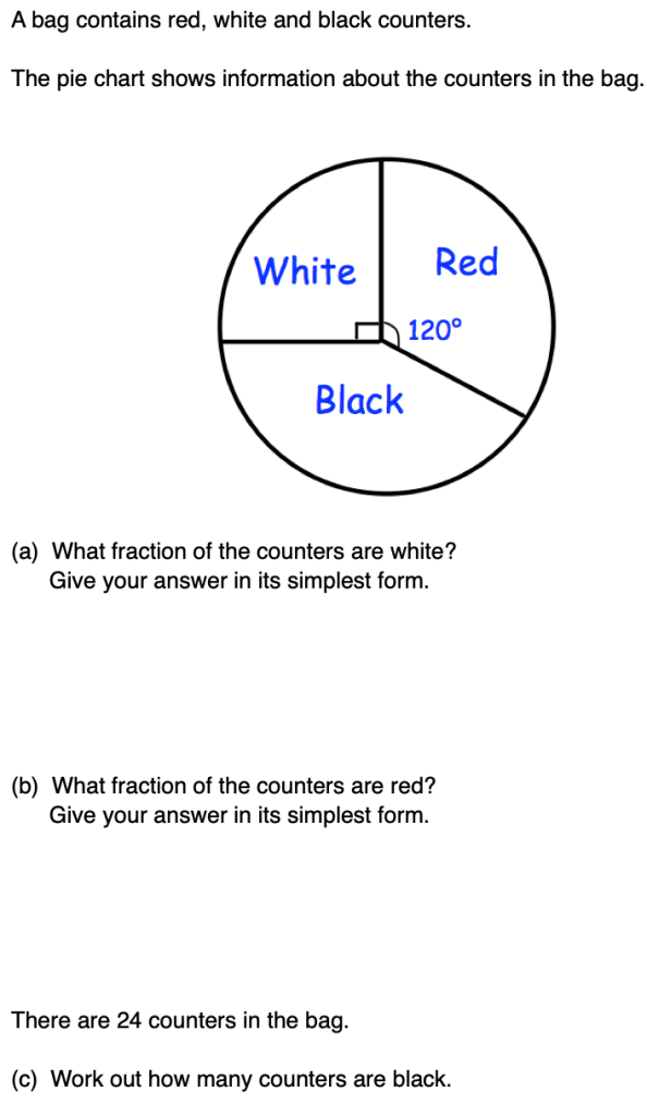
A pie chart is a circle which is broken up into sectors, such that the size of the angle in the sector represents the proportion of the frequency taken up by the category it represents.
Pie charts are particularly useful when we are interested in proportion, for instance if we are looking at what we spend our money on and want to see clearly where most money is being spent and how this compares with other things we spend money on.
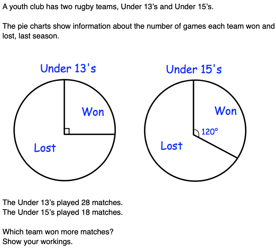
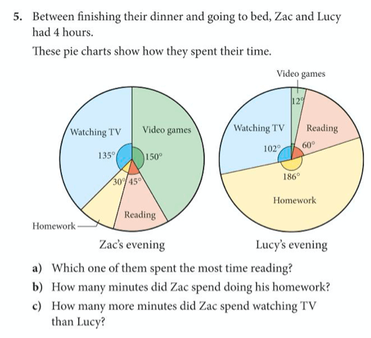
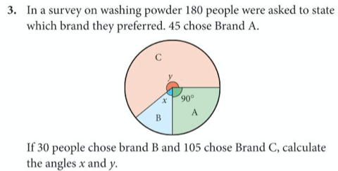
In order to read information from pie charts we must remember that there are 360 degrees in a circle and consider how many degrees the sectors we are interested in include.
Let’s try some questions involving pie charts that are similar to iGCSE examination questions:


Now have a go on your own at the following from exercise 3 and exercise 4 on pages 143 and 144 of the core textbook (some questions have been removed that required you to draw pie charts).

Below are the answers: