Pictograms
One of the easiest ways to present data is with a pictogram.
Here a small picture or symbol is used to represent frequency, for instance if we are looking at how many cars are parked outside our building on a specific day, we could use a picture of a car to represent a specific number of cars, e.g. 10 cars.

A pictogram must include a key so that whoever is reading it knows how many cars each picture refers to.
- In the above pictogram:
- On which day were most cars parked outside the building?
- How many cars were outside the building on Friday?
- How would you represent 25 cars in the pictogram?
- How would you represent 22 cars?
Have a go at exercise 1 on pages 138 to 139 of your core textbook:
The answers are below:

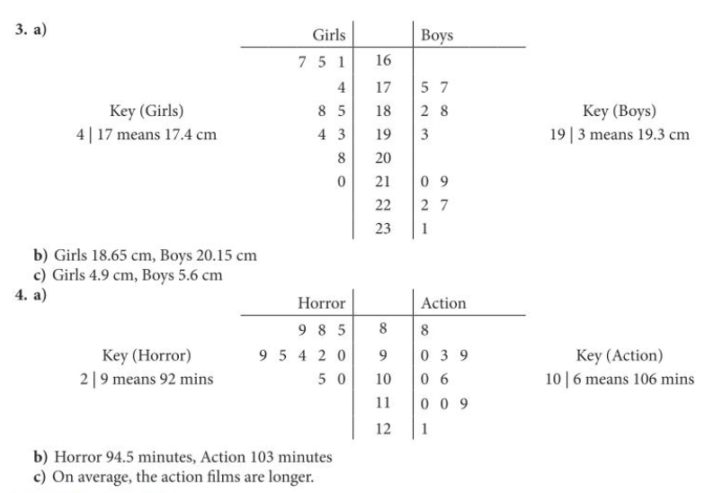
Stem-and-Leaf Diagrams
A stem-and-leaf diagram is a great way to visually represent a small dataset.
It is nice because we don’t “lose” the values of the raw data by grouping them, but at the same time we can see the patterns in the data, and can easily compare two data sets.
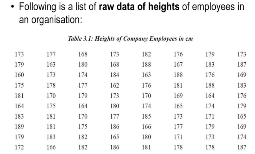
Let’s put the above data into a stem and leaf diagram. The steps we will follow are these:
- Choose what we will use for our “stems” (we should try to have between 5 and 10 of these)
- Enter our data into the “leaves” (don’t worry about the order when you do this and just go from left to right in the raw data)
- Draw a new “ordered” stem and leaf diagram. It is very important here that the gaps between the leaves are equal, otherwise the diagram will be deceptive.
- Write a key so that people using the diagram can see clearly what it refers to and in particular what the stems mean.
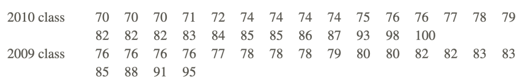
With everything in mathematics, once we have learned it is very important to repeat it several times so that it becomes an automatic skill. So let’s do one more stem-and-leaf diagram together with the following data:
When we have two datasets we want to compare, we put the stems in the middle and the leaves of one dataset go on the left and the leaves of the other dataset on the right. Let’s try it for the data below which shows test results for two different classes:
Reading the median from a stem-and-leaf diagram is also fairly convenient, because you can count across the leaves to the middle number, being careful with the order – if you are counting from the top work outwards from the middle, whereas if you are counting from the bottom work inwards from the outside.
The modal class is also easy to spot.
Now you are ready to try some yourselves. Below are the questions from exercise 2 on pages 140 to 141 of your textbook.
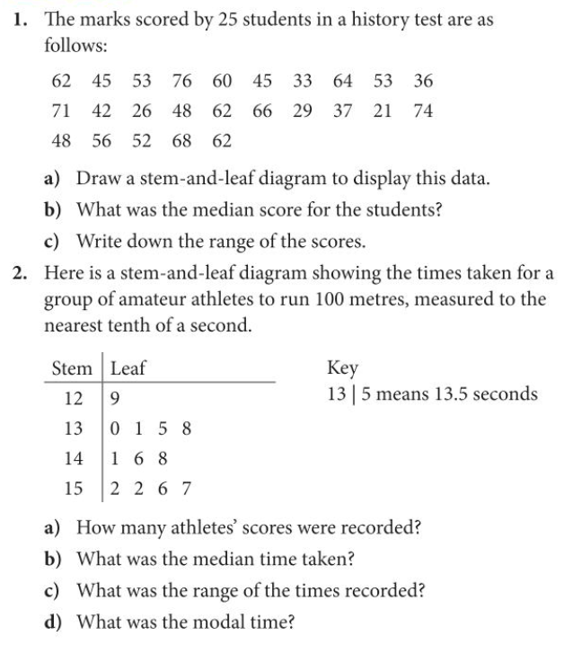
Here are the answers for the above questions: