When we are dealing with continuous data, we usually use a more sophisticated form of graph than the bar chart, which is called a histogram.
In future years we will learn more about histograms, and particularly about how they can be drawn using frequency density instead of frequency, so that the diagram will give a fair representation of the data, even if the classes it is grouped into are of unequal width.
For this year though, the only significant difference between bar charts and histograms that we need to remember is that we never have gaps between the bars (because the data is continuous, so doesn’t have gaps in it!)
Example
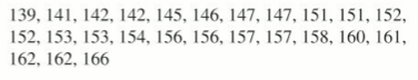
Let’s try grouping together and then draw a histogram of the below data, which tells us the height of 25 children measured to the nearest centimetre:
Exercise
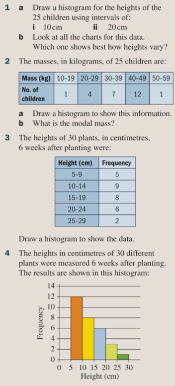
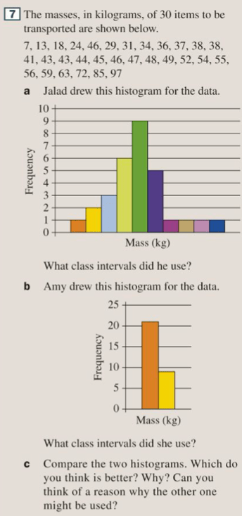
Let’s complete exercise 12D on pages 178 and 179 of the textbook:

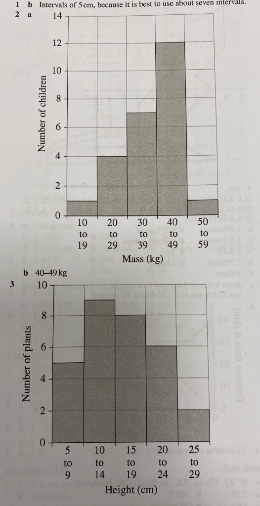
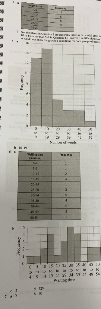
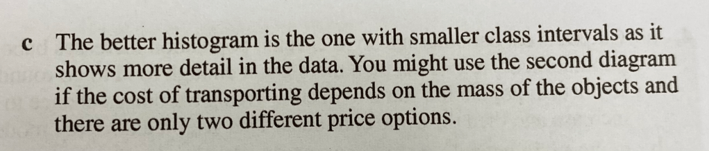
The answers are below: