The vast majority of the graphs we look at during our course are frequency graphs, that is they deal with how many of something we have.
Sometimes we are interested in how many people have brown eyes or blue eyes, or how many people there are in each different year group. In this case we are dealing with discrete data, which is generally more straightforward.
Sometimes we are interested in how many people there are at each different height or each different weight. In this case we are dealing with continuous data, which tends to be a little more complicated and a little more interesting.
Earlier in the year we looked at bar charts to display frequency, now we are going to talk more about pie charts.
Because there are 360 degrees in a circle, in a pie chart every 1 degree represents 1/360 of our total frequency. So if we want to work out how many degrees are represented by each class, we can use the formula (number in class) / (total number) ÷ 360 to work out how many degrees in the pie that class should take up.
Example
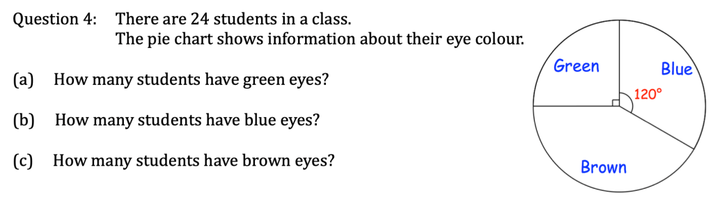
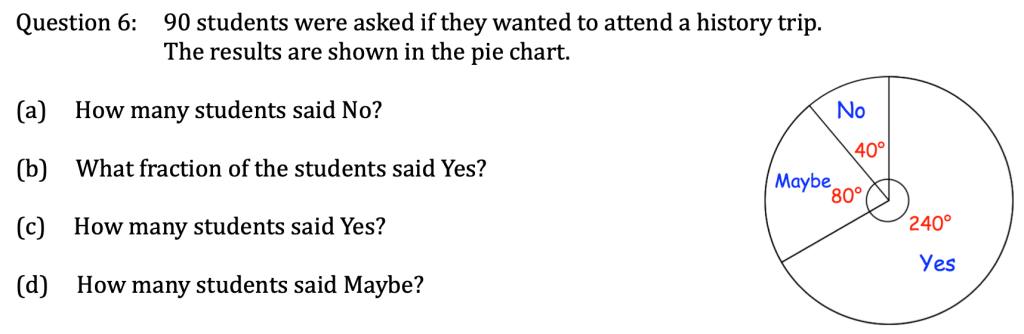
Let’s try reading some information from pie charts:

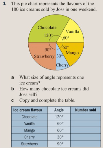
Exercise
So let’s practice this in exercise 12B on pages 174 to 175 of the textbook:


The answers are below:

